Looking at Digital Art (I)
Introduction: Why Digital Art?
So, you’ve stumbled upon digital art—maybe on Instagram, Foundation, or perhaps through that one friend who insists on showing you yet another NFT. But what’s the deal with digital art? Why should you care?
Digital art has gone from obscure corners of the internet to headlining galleries and breaking auction records. It’s the love child of technology and creativity, constantly evolving–which can get VERY confusing.
Art History books can sometimes feel daunting, snooty, using all sorts of complicated terms that you can’t/won’t be bothered to look up. Understandably.
But don’t you worry—I’m here to help you look at digital art, without the overcomplication.
In this series, we’ll break it down, starting with the basics: color, composition, and texture. Grab your coffee (or tea, I don’t judge), and let’s dive in.
Color: The Emotional Punch You Didn’t See Coming
Color is like the opening line of a text from your ex—it gets your attention and immediately makes you feel something (manifesting that they’re knee deep in your block list).
In digital art, color takes on an even more powerful role because artists can manipulate hues in ways traditional mediums just can’t compete with. Think hyper-saturated neons, dreamy pastels, or monochrome palettes that whisper "minimalism" (or shout it, depending on the mood).
Why It Matters: Colors are part of the emotional blueprint of an art piece—including when they’re deliberately left out. Red? Think passion or rage. Blue? It’s all about calmness or melancholy. In digital art, the backlit screen boosts the emotional punch, making colors more intense and almost otherworldly.
How to Look at It: Start by noticing how the colors interact. Are they harmonious, like a perfectly balanced playlist, or do they create tension, like an unexpected jazz chord? Is there a specific mood, vibe, or theme that color pulls you into? Think about how the artist is using that color palette to mess with your emotions (in a good way, of course).
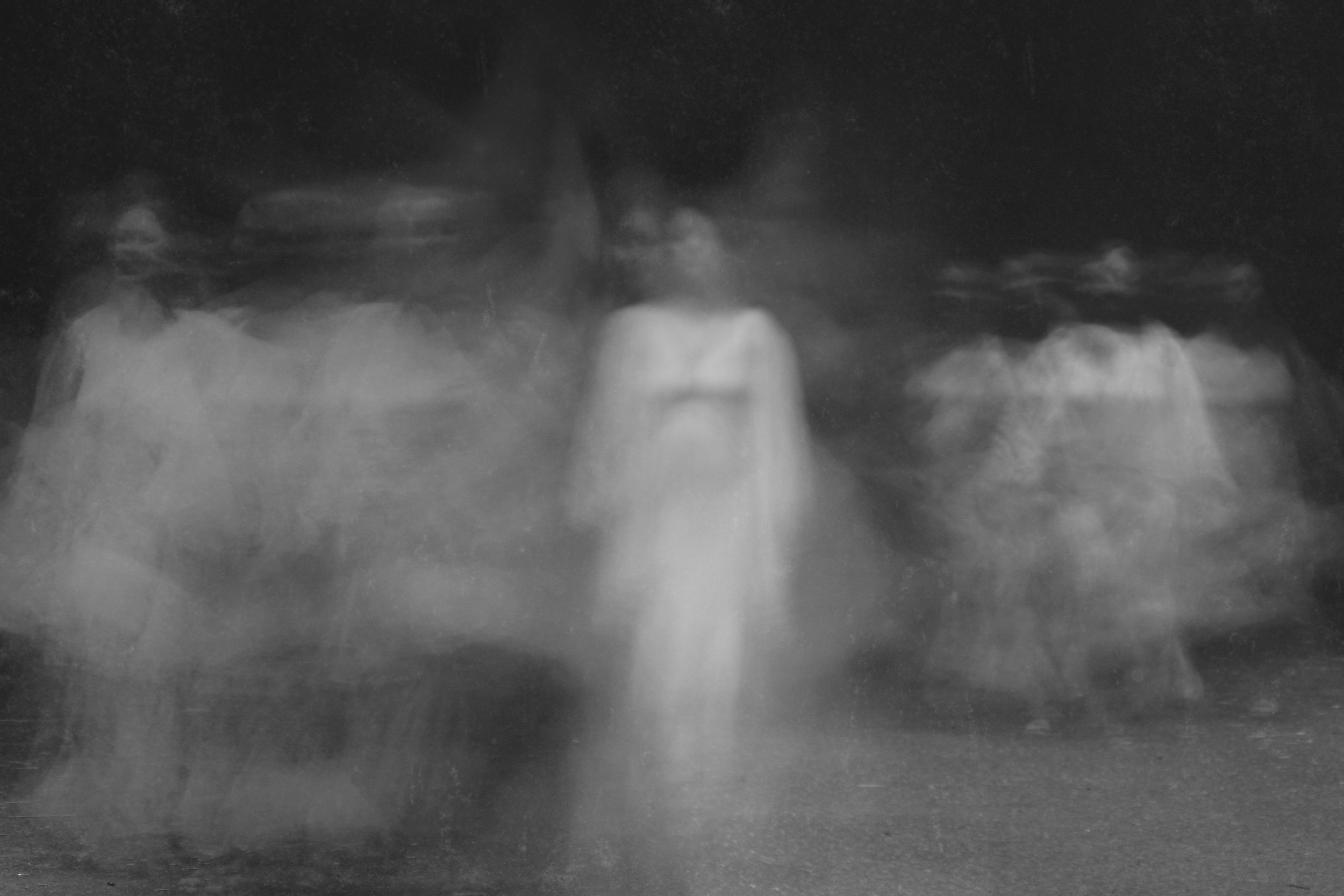
Examples: Take a peek at my friend, Nilus Dante’s work: in Lazarus: Return of the Dead, the colors aren’t there–a black and white monochromatic photographic piece. The sentiment is eerie, melancholic. And similarly, look at his Æther, The Lumith. There is strong, vibrant color. Almost neon, but from a lit-within luminosity.
Composition: A Game of Eye-Tag
Composition is basically the artist's way of guiding your eye. Where do they want your eyes to go first? Second? Maybe they want to mess with you and keep your eye darting all over the place—either way, composition is the backbone of visual storytelling.
Why It Matters: Think of composition like choreography. It’s all about balance, or sometimes, intentional imbalance. A great composition can make you feel like you’re part of the art itself, and suddenly, you're on a rollercoaster ride, not just standing on the sidelines.
How to Look at It: Take a step back and observe the placement of elements. Is there a clear focal point, or are you being tricked into wandering through the entire piece? Ask yourself if the arrangement feels harmonious or chaotic—and then ask why. Spoiler: Sometimes the chaos is the point.
Examples: Refik Anadol’s data-driven works have a hypnotic composition that takes your eye on a well-orchestrated journey. On the flip side, an artist like Beeple might deliberately overload your senses with a million things at once, making your brain ping-pong from one element to another.
Texture: The Digital Illusion You Can’t Feel (But Wish You Could)
You can’t touch most digital art (unless you’re one of those people who still smudges their screen), but that doesn’t stop artists from making you feel texture in digital form. Whether it's a smooth, glassy surface or gritty pixelation, texture adds a whole new layer to digital pieces—pun intended.
Why It Matters: Texture gives digital art its “I swear I can feel this” quality, even though it’s just pixels. A smooth, glossy surface might evoke something futuristic and synthetic, while a rough, glitchy texture pulls you into a more chaotic, deconstructed world that feels alive. It’s an extra layer of experience that makes digital art stand out from its more traditional cousins.
How to Look at It: Zoom in (but not too much, or you'll just see pixels). Does the texture feel hyper-real, like it could exist in the physical world, or does it revel in its digital roots? Think about how texture plays with your expectations—are you looking at a glossy, polished surface like Hayden Clay’s cinematic 3D creations, or something more fragmented and raw, like Fahad Karim’s chaotic, glitch-inspired pieces? Does the texture enhance the sense of reality, or does it throw you into a digital dreamscape?
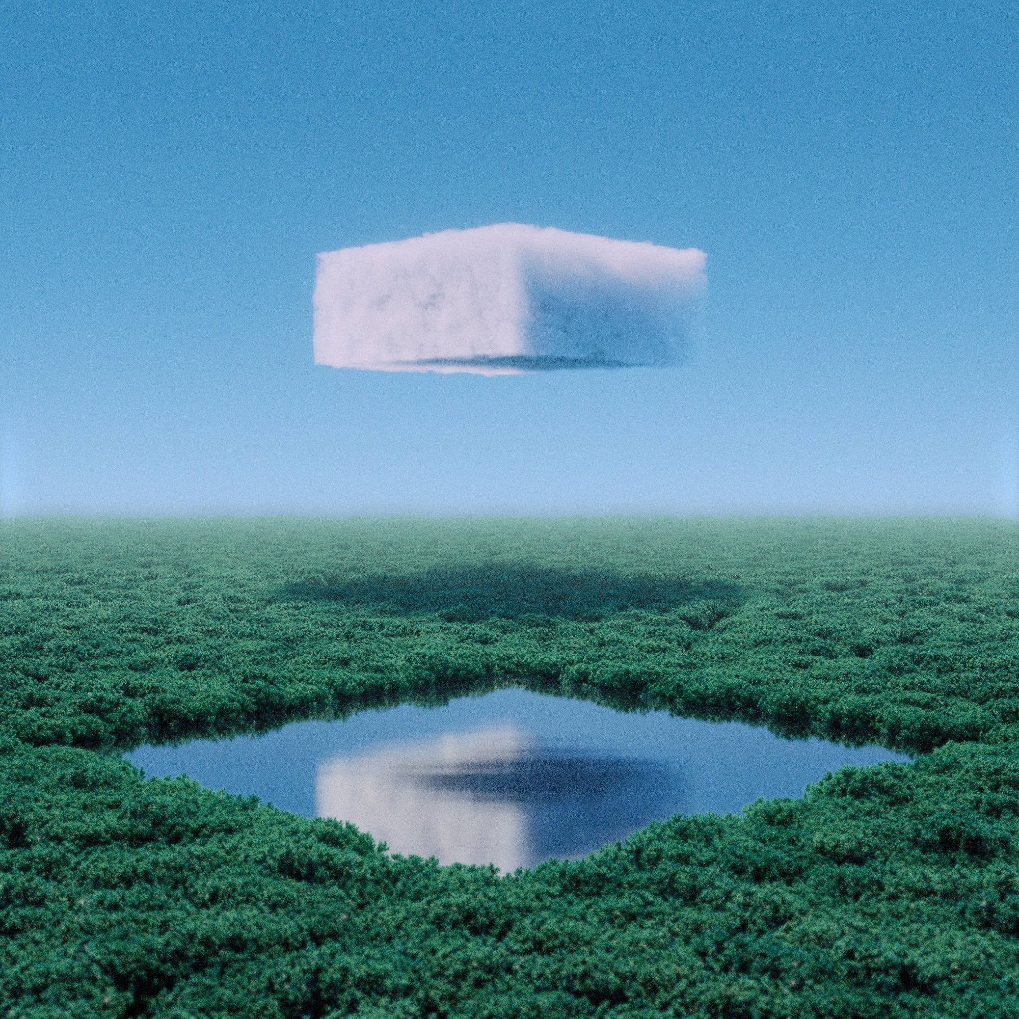
Examples: Hayden Clay’s work looks like a photograph of a parallel universe: the textures are so realistic, and yet, we consciously know they’re impossible. Cubic clouds, clothing made out of water. His work is incredibly three-dimensional, and rife with different textures. XCOPY, on the other hand, is a master of glitch textures, creating fragmented, distorted works that feel chaotic and raw, often with a very 2D look. His use of pixelation, jagged lines, and corrupted visuals give his art a rebellious, frenetic energy. The textures in his work are intentionally disruptive, often evoking a sense of decay, digital malfunction, or dystopia. Each jagged glitch is a visual scream, a reminder that the digital world is as fragile and imperfect as any other medium.
Artwork Description: The Cheat Code You Didn’t Know You Needed
We all love a good mystery, but sometimes, cracking open an artwork description can feel like finding the cheat code in a video game. It’s the artist’s way of giving you some behind-the-scenes insight into their thought process—without making you feel like you’re missing some secret password.
Why It Matters: Artwork descriptions can be the key to understanding an artist’s intention, especially in digital art where concepts, technical processes, or new media (hello, NFTs!) may not always be immediately obvious. They often provide context on the theme, the medium, or the inspiration behind the work, helping you connect the dots between what you see and what the artist wanted you to feel.
How to Look at It: When you read an artwork description, don’t skim it like the terms and conditions you scroll past (guilty). Pay attention to keywords—does the artist mention specific tools or software, like Blender or Procreate? Maybe they reference a digital trend, like glitch art or VR. Think of the description as a mini-map guiding you through their creative process.
Examples: Let’s say you come across a description that reads: “This piece explores the fragmented nature of memory using glitch techniques to represent digital decay.” Now you’ve got some context to understand why the artwork feels chaotic, pixelated, and distorted—it’s a metaphor for memory’s fragile, broken nature. Artists like Sarah Zucker or Rafael Rozendaal often give just enough context in their descriptions to help you catch the vibe of the artwork or series, while still leaving room for interpretation.
Pro Tip: If the description is a bit vague or overly technical, think of it as an open invitation to form your own interpretation. Some artists like to keep things cryptic so you can project your own experiences and emotions onto the work.
Exercise: let’s try looking at stuff
Alright, time for you to flex those newfound digital art muscles. Pick a digital artwork that grabs your attention (it’s okay to choose based on color alone—we’re visual creatures, after all). Start by dissecting the use of color: What vibe is the artist going for? Move on to composition: Where does your eye go first, and why? Finally, take a closer look at the texture. Does it feel smooth, pixelated, or something in between?
Too lazy to look for a piece? Here are a couple:
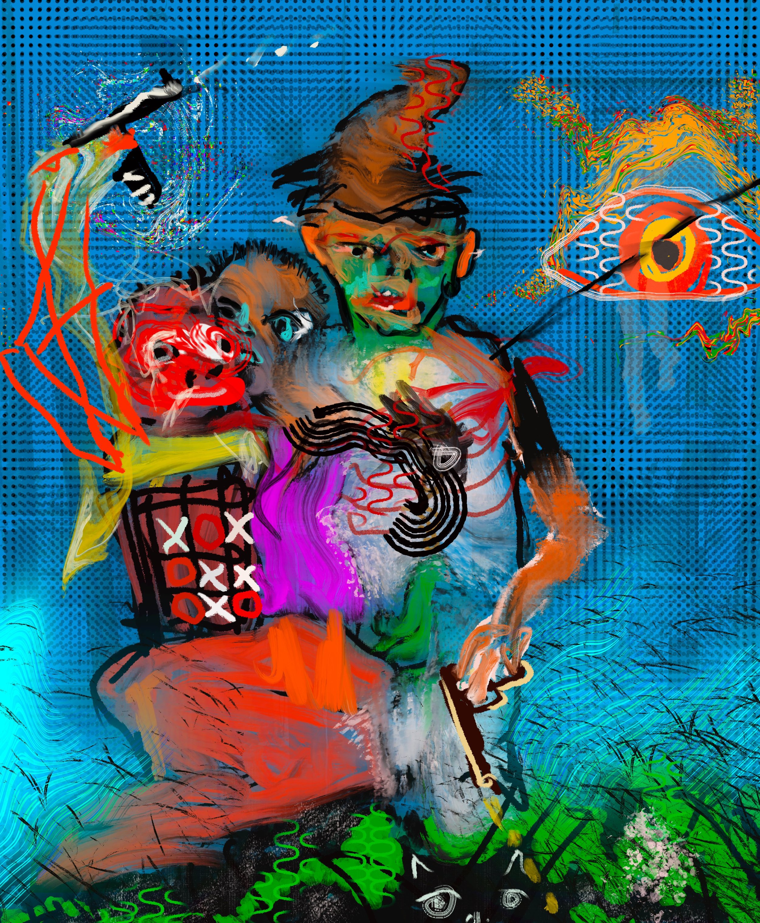
Robin Hood and the Second Amendment, by Michael Hafftka
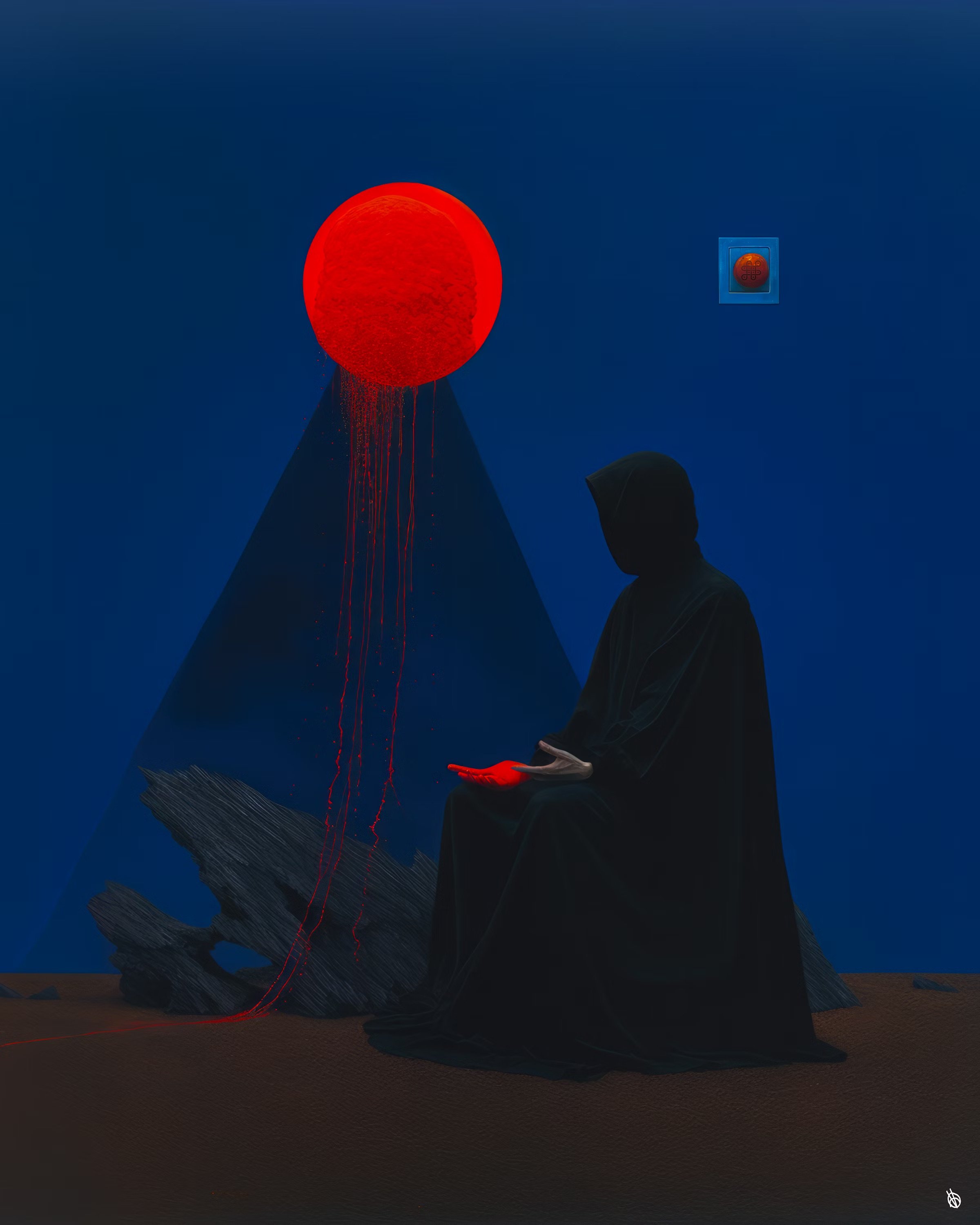
A:Ω | 0:8, by BLAC
Bonus points if you compare it to a traditional piece of art and note what feels different in the digital realm. Does it comment on art history? Does it nod at history at all?
that wasn’t too bad.
You’ve just leveled up your art appreciation skills—congrats!
By focusing on color, composition, and texture, you’re already ahead of the game when it comes to understanding digital art.
In the next part of this series, we’ll decode the hidden messages and symbols often tucked inside digital works.
Get ready to dive into a world where memes meet high art. Yes, it’s as fun as it sounds.

